CSS3基础知识之表单表格学习
0x01 表单相关属性介绍
描述: 在HTML中我们常常会输入一些数据传递到后端,所以会使用到 form 元素 或者 input 元素、textarea 元素 以及那些用来包含和标记表单特定部分的 <fieldset> 和 <legend> 元素,除此之外HTML5 还包含了允许 Web 开发者指定必填区域的特性,甚至还能检验填入内容的类型。
所以此章节,跟随作者一起简单了解一下表单开发时的常常使用到的相关字体文本、位置、边框等CSS属性,实际上基本都是前面我们所学习的属性,此处就当一个复习进行展开吧;在后续中我们学过Javascript后再回来看看处理诸如验证和创建自定义表单控件之类的事情。
border-radius 属性 – 设置外边框圆角
描述: 此 border-radius 属性允许你设置元素的外边框圆角,当使用一个半径时确定一个圆形,当使用两个半径时确定一个椭圆,此(椭)圆与边框的交集形成圆角效果。
温馨提示: 该属性实际上是一个简写属性,其实际上是这四个属性 border-top-left-radius、border-top-right-radius、border-bottom-right-radius (en-US),和 border-bottom-left-radius 的简写。
语法参数:
/* 示例1.<length> 定义圆形半径或椭圆的半长轴,半短轴 */
border-radius: 1em/5em;
/* 等价于 */
border-top-left-radius: 1em 5em; border-top-right-radius: 1em 5em;
border-bottom-right-radius: 1em 5em; border-bottom-left-radius: 1em 5em;

border-radius: 4px 3px 6px / 2px 4px;
/* 等价于: */
border-top-left-radius: 4px 2px;
border-top-right-radius: 3px 4px;
border-bottom-right-radius: 6px 2px;
border-bottom-left-radius: 3px 4px;

/* 示例2.使用百分数定义圆形半径或椭圆的半长轴,半短轴。水平半轴相对于盒模型的宽度;垂直半轴相对于盒模型的高度。 */
border-radius: 10% 30% 50% 70%;
/* 等价于: */
border-top-left-radius: 10%;
border-top-right-radius: 30%;
border-bottom-right-radius: 50%;
border-bottom-left-radius: 70%;
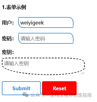
示例演示:
<form action="https://api.weiyigeek.top/demo/index.php">
  <div><label for="user">用户:</label>
  <input type="text" id="user" name="username" value="weiyigeek" placeholder="请输入用户名"></div>
  <div><label for="pass">密码:</label>
  <input type="password" id="pass" name="password" placeholder="请输入密码"></div>
  <div><label for="pass">密钥:</label></div>
  <textarea name="key" id="key" placeholder="请输入密钥"></textarea>
  <div class="buttons"><input type="submit" value="Submit"> <input type="reset" value="Reset"> </div>
</form>
<style>
  label {font-weight: bold;}
  /* 使用 body 中或者一个父元素中定义的字体 */
  button,input,select, textarea {
    box-sizing: border-box;
    padding: 0;
    margin: 0;
    font-family: inherit;
    font-size: 100%;
  }

  /* 输入元素边框等样式设置 */
  input[type="text"],
  input[type="password"] {
    margin: 0 0 1em 0;
    padding: 5px;
    border: 2px solid rgb(51, 143, 230);
    border-radius: 10px 100px / 120px;
    width: 20%;
  }

  /* 避免 IE 在不需要滚动条的时候显示滚动条 */
  textarea {
    overflow: auto;
    margin: 0.5em 0 1em 0;
    padding: 5px;
    border: 2px dashed rgb(0,0,0);
    border-radius: 10% 30% 50% 70%;
    width: 30%;
  }
  /* 若要针对元素使用移入和获取焦点时变化,则使用如下伪类选择器 */
  textarea:hover, textarea:focus {
    border: 2px solid rgb(51, 143, 230);
  }

  /* 按钮显示样式,以及使用伪类选择器进行获取焦点 */
  input[type="submit"],
  input[type="reset"] {
    padding: 10px 2em;
    border: 2px solid rgb(51, 143, 230);
    border-radius: 5px;
    color: rgb(51, 143, 230);
    background-color: #fff;
    font-weight: bold;
  }
  input[type="submit"]:hover, input[type="submit"]:focus {
    background-color:rgb(51, 143, 230);
    color: white;
  }
  input[type="reset"]:hover, input[type="reset"]:focus {
    background-color:rgb(255, 0, 0);
    color: white;
    border: 2px solid rgb(255, 0, 0);

  }
</style>
执行结果:
温馨提示: 跨浏览器的 form 元素对于不同的挂件使用不同的盒子约束规则, 为了保证在给 form 元素设定宽度和高度的统一,最好将所有元素的内外边距都设为 0,然后在单独进行样式化控制的时候将这些加回来, 例如上述示例中的
box-sizing: border-box;
padding: 0;
margin: 0;
0x02 表格相关属性介绍
描述: 在前端开发显示统计功能以及查询功能所展示的页面,往往需要使用HTML表格来呈现,所以此章节我们将学习如何有效地对 HTML 表格进行样式化,以及其相关的CSS属性介绍和实践。
table-layout 属性 – 设置表格的单元格、行和列宽带的算法
描述: 此属性定义了用于布局表格的单元格、行和列的算法,简单的说使用 table-layout: fixed 创建更可控的表布局,可以通过在标题width中设置width来轻松设置列的宽度。
语法参数:
/* 关键字值 */
table-layout: auto;  自动表格布局算法, 表格及其单元格的宽度会根据内容自动调整大小。
table-layout: fixed; 固定表格布局算法(缺省), 需要使用 `length`、`percent` 来指定宽度,例如 `width: 150px; 或 width: 100%;`
示例演示:示例1.设置表格列(cols)的宽度
<style>
table {
  table-layout: fixed;
  width: 120px;
  border: 1px solid red;
}
td {
  border: 1px solid blue;
  overflow: hidden;
  white-space: nowrap;
  text-overflow: ellipsis;
}
</style>
示例2.固定表格布局与自动表格布局对比.
<style>
table { border: 1px solid black;}
table.one {table-layout: automatic}
table.two {table-layout: fixed}
</style>
<table class="one" width="100%">
<td width="20%">1000000000000000000000000000</td>
<td width="40%">10000000</td>
<td width="40%">100</td>
</table>
<br />
<table class="two" width="100%">
<td width="20%">1000000000000000000000000000</td>
<td width="40%">10000000</td>
<td width="40%">100</td>
</table>
执行结果:
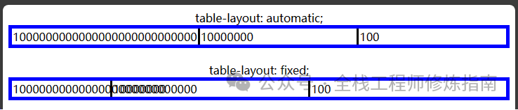
总结说明:固定表格布局与自动表格布局相比,允许浏览器更快的对表格进行布局;这是因为固定表格仅取决于表格宽度、列宽度、表格边框宽带,以及单元格间距,而与单元格的内容无关;在浏览器渲染时在接收到表格第一行后便可显示表格,而后者需要根据内容计算来显示表格所以加载时会稍慢。
visibility 属性 – 设置表格或其他元素是否可见或不可见
描述: 此属性可以显示或隐藏元素而不更改文档的布局,此外该属性还可以隐藏 <table> 元素中的行或列。
温馨提示: 此属性指定是否显示一个元素生成的元素框,这意味着即使不可见的元素也会占据页面上的空间;所以若你要创建不占据页面空间的不可见元素请使用 "display:none" 属性替代。
语法参数:
/* 关键字值 */
visibility: visible;  /* 元素框可见 */
visibility: hidden;   /* 元素框不可见(不绘制),但仍然影响常规的布局占据着空间 */
visibility: collapse; /* 对于表格元素隐藏表格的行或列以及折叠的弹性元素和 ruby 元素会被隐藏,并且不占用任何空间 ,而对于其他元素,collapse 被视为与 hidden 相同*/
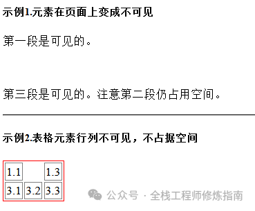
示例演示:
示例1.使用使html元素在页面上变成不可见。
<style>
.visible {
  visibility: visible;
}
.not-visible {
  visibility: hidden;
}
</style>
<p class="visible">第一段是可见的。</p>
<p class="not-visible">第二段是不可见的。</p>
<p class="visible">第三段是可见的。注意第二段仍占用空间。</p>
示例2.将表格元素的 visibility 属性 设置为 collapse 使之不可见。
<style>
table {
  border: 1px solid red;
}
td {
  border: 1px solid gray;
}
.collapse {
  visibility: collapse;
}
</style>
<table>
  <tr>
    <td>1.1</td>
    <td class="collapse">1.2</td>
    <td>1.3</td>
  </tr>
  <tr class="collapse">
    <td>2.1</td>
    <td>2.2</td>
    <td>2.3</td>
  </tr>
  <tr>
    <td>3.1</td>
    <td>3.2</td>
    <td>3.3</td>
  </tr>
</table>
执行结果:
caption-side 属性 – 设置表格的标题位置
描述: 此属性会将表格的标题(<caption>)放到规定的位置,是具体显示的位置与表格的 writing-mode 属性值有关。
语法参数:
/* 方向值 */
caption-side: top;  /* 标题盒应置于表格上方。 */
caption-side: bottom; /* 标题盒应置于表格下方 */

/* 逻辑值 */
caption-side: block-start; /* 标题盒应置于表格的块首一侧 */
caption-side: block-end;   /* 标题盒应置于表格的块末一侧 */
caption-side: inline-start;/* 标题盒应置于表格的行首一侧 */
caption-side: inline-end;  /* 标题盒应置于表格的行末一侧 */
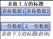
示例演示:
<style>
table {
  border: 1px solid black;
  background-color: white;
  background-image: linear-gradient(to bottom, rgba(0,0,0,0.1), rgba(54, 118, 214, 0.5));
}
td {
  border: 1px solid blue;
}
.top caption {
  caption-side: top;
  font-weight: bold;
}
.bottom caption {
  caption-side: bottom;
  font-style: italic;
}
</style>
<table class="top">
  <caption>表格上方的标题</caption>
  <tr>
    <td>表格数据1</td>
    <td>表格数据2</td>
  </tr>
</table>
<br />
<table class="bottom">
  <caption>
    表格下方的标题(斜体)
  </caption>
  <tr>
    <td>一些数据</td>
    <td>又一些数据</td>
  </tr>
</table>
执行结果:
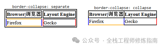
border-collapse 属性 – 设置表格的边框是独立或合并
描述: 此属性在表格样式设计中非常实用,其用来决定表格的边框是分开的还是合并的。
在分隔模式下,相邻的单元格都拥有独立的边框。在合并模式下,相邻单元格共享边框。
语法参数:
/* Keyword values */
border-collapse: collapse;
/* 合并(collapsed)模式下,表格中相邻单元格共享边框,其边框border-style 的值 inset 表现为槽,值 outset 表现为脊。 */
border-collapse: separate;
/* 分隔(separated)模式是 HTML 表格的传统模式, 即单元格拥有独立的边框,其边距是按照 border-spacing 来确定的 */
示例演示:
示例1.各个浏览器引擎的多彩表格
<style>
.collapse {
  border-collapse: collapse;
}
.separate {
  border-collapse: separate;
}
table {
  display: inline-table;
  margin: 1em;
  border: solid 2px;
}
table th,
table td {
  border: solid 2px;
}
.fx {
  border-color: orange blue;
}
.gk {
  border-color: black red;
}
</style>
<table class="separate">
  <caption><code>border-collapse: separate</code></caption>
  <tbody>
    <tr>
      <th>Browser|浏览器</th>
      <th>Layout Engine</th>
    </tr>
    <tr>
      <td class="fx">Firefox</td>
      <td class="gk">Gecko</td>
    </tr>
  </tbody>
</table>
<table class="collapse">
  <caption>
    <code>border-collapse: collapse</code>
  </caption>
  <tbody>
    <tr>
      <th>Browser|浏览器</th>
      <th>Layout Engine</th>
    </tr>
    <tr>
      <td class="fx">Firefox</td>
      <td class="gk">Gecko</td>
    </tr>
  </tbody>
</table>
执行结果:
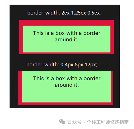
border-width 属性 – 设置表格的边框宽度
描述: 此 border-width 属性可以设置盒子模型的边框宽度。
语法示例
/* 用法一:明确指定宽度值 */
/* 当给定一个宽度时,该宽度作用于选定元素的所有边框 */
border-width: 5px;
/* 当给定两个宽度时,该宽度分别依次作用于选定元素的横边与纵边 */
border-width: 2px 1.5em;
/* 当给定三个宽度时,该宽度分别依次作用于选定元素的上横边、纵边、下横边 */
border-width: 1px 2em 1.5cm;
/* 当给定四个宽度时,该宽度分别依次作用于选定元素的上横边、右纵边、下横边、左纵边(即按顺时针依次作用) */
border-width: 1px 2em 0 4rem;

/* 用法二:使用全局关键字 */
/* 可以使用的全局关键字有:inherit(继承),initial(初始值),unset(不设置) */
border-width: inherit;

/* 用法三:使用作用于 border-width 的关键字 */
border-width: thin;   /* 细边线 */
border-width: medium; /* 中等边线 */
border-width: thick;  /* 宽边线 */
示例演示:
/* 示例1.顶部 纵边 下横边 */
border-width: 2ex 1.25ex 0.5ex;

/* 示例2.上横边、右纵边、下横边、左纵边 */
border-width: 0 4px 8px 12px;
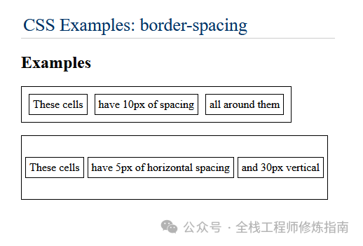
border-spacing 属性 – 设置表格分隔边框的距离
描述:此属性属性只适用于边框分离模式(即border-collapse: separate),指定相邻单元格边框之间的距离, 其相当于 HTML 中的 cellspacing 属性,但是第二个可选的值可以用来设置不同于水平间距的垂直间距。
语法参数:
/* <length> */
border-spacing: 2px;

/* horizontal(水平距离) vertical (垂直距离)
horizontal : 描述相邻两列的单元格之间的水平距离的一个 <length> 值。
vertical : 描述相邻两行的单元格之间的垂直距离的一个 <length> 值。
*/
border-spacing: 1cm 2em;
示例演示:
<style type="text/css">
.horizontal {
 border-collapse: separate;
 border-spacing: 10px;
 border: 1px solid #000;
  /* border-width: 1px;  边框宽度 */
}
.both {
 border-collapse: separate;
 border-spacing: 5px 30px;
 border: 1px solid #000;
}
.black {
 border: 1px solid #000;
 padding: 5px;
}
</style>

<h1>CSS Examples: border-spacing</h1>
<table class="horizontal">
 <tr>
  <td class="black">These cells</td>
  <td class="black">have 10px of spacing</td>
  <td class="black">all around them</td>
 </tr>
</table>
<br />
<table class="both">
 <tr>
  <td class="black">These cells</td>
  <td class="black">have 5px of horizontal spacing</td>
  <td class="black">and 30px vertical</td>
 </tr>
</table>
执行结果:
vertical-align 属性 – 指定行内或表格元素垂直对齐方式
描述: 此属性用来指定行内元素(inline)、行内块(inline-block)或表格单元格(table-cell)元素的垂直对齐方式,但请注意其不能用于块级元素的垂直对齐。
Tips: vertical :英 [‘vɜːtɪk(ə)l]:adj. 垂直的,直立的;[解剖] 头顶的,顶点的
语法参数:
# 语法
vertical-align: baseline; sub; super; text-top; text-bottom; middle; top; bottom;

# 参数
* baseline: 使元素的基线与父元素的基线对齐。
* sub:使元素的基线与父元素的下标基线对齐。
* super:使元素的基线与父元素的上标基线对齐。
* text-top:使元素的顶部与父元素的字体顶部对齐。
* text-bottom:使元素的底部与父元素的字体底部对齐。
* middle:使元素的中部与父元素的基线加上父元素 x-height(译注:x 高度)的一半对齐。
* <length>:使元素的基线对齐到父元素的基线之上的给定长度。可以是负数。
* <percentage>:使元素的基线对齐到父元素的基线之上的给定百分比。
* 相对行的值:top (顶部)、 bottom (底部)
* 表格单元格的值:baseline ( 以及 sub, super, text-top, text-bottom, <length>, <percentage> )、top、middle、bottom
示例演示:示例1.设置图像元素对齐。
<style type="text/css">
  img.baseline {vertical-align: baseline;}
  img.top {vertical-align:top}
  img.texttop {vertical-align:text-top}
  img.bottom {vertical-align:bottom}
  img.textbottom {vertical-align:text-bottom}
  img.middle {vertical-align:middle}
  img.sub {vertical-align:sub}
  img.super {vertical-align:super}
  img.baifenbi {vertical-align:-200%;}
  img.em {vertical-align:2em;}
</style>

<p>这是一幅<img class="baseline" border="0" src="./eg_cute.gif" />把元素的顶端与行中最高元素的顶端对齐-baseline</p>

<p>这是一幅<img class="top" border="0" src="./eg_cute.gif" />把元素的顶端与父元素字体的顶端对齐-text-top</p>
<p>这是一幅<img class="texttop" border="0" src="./eg_cute.gif" />把元素的顶端与行中最高元素的顶端对齐-top</p>

<p>这是一幅<img class="bottom" border="0" src="./eg_cute.gif" />把元素的底端与父元素字体的底端对齐-text-bottom</p>
<p>这是一幅<img class="textbottom" border="0" src="./eg_cute.gif" />把元素的顶端与行中最低的元素的顶端对齐-bottom</p>

<p>这是一幅<img class="middle" border="0" src="./eg_cute.gif" />把此元素放置在父元素的中部-middle</p>
<p>这是一幅<img class="sub" border="0" src="./eg_cute.gif" />垂直对齐文本的下标-sub</p>
<p>这是一幅<img class="super" border="0" src="./eg_cute.gif" />垂直对齐文本的上标-super</p>
<p>这是一幅<img class="baifenbi" border="0" src="./eg_cute.gif" />使用 "line-height" 属性的百分比值来排列此元素,允许使用负值。</p>
<p>这是一幅<img class="em" border="0" src="./eg_cute.gif" />使用em的长度</p>
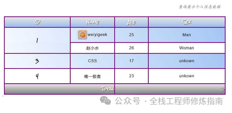
示例2.常规表格样式设计以及背景、文字、图像综合演示。
<!DOCTYPE html>
<html lang="en">
<head>
  <meta charset="UTF-8">
  <meta name="viewport" content="width=device-width, initial-scale=1.0">
  <title>表格展示示例</title>
  <link href="https://fonts.bootcdn.cn/css?family=Rock+Salt" rel="stylesheet" type="text/css" />
</head>
<body>
  <style>
  html {
    font-family: "helvetica neue", helvetica, arial, sans-serif;
  }
  table {
    table-layout: fixed; /* 根据列标题的宽度来规定列的宽度,然后适当地处理它们的内容。 */
    width: 100%;
    border: 3px solid purple;
    border-collapse: collapse;     /* 将表格边框合为一条。 */
  }
  caption {
    padding: 20px;
    caption-side: right;
    text-align: right;
    letter-spacing: 1px;
    font-family: "Rock Salt", cursive;
    font-style: italic;
    color: #666;
  }

  thead, tfoot {
    color: white;
    text-shadow: 1px 1px 1px black;
    border: 3px solid purple;
  }

  /* 使用了thead th:nth-child(n) 选择了四个不同的标题 (:nth-child) 选择器(选择第 n 个子元素) 设置。 */
  thead th {
    background: linear-gradient(to bottom, rgba(0,0,0,0.1), rgba(54, 118, 214, 0.5));
    font-family: "Rock Salt", cursive;
    border: 3px solid purple;
  }
  thead th:nth-child(1) {
    width: 30%;
  }
  thead th:nth-child(2) {
    width: 20%;
  }
  thead th:nth-child(3) {
    width: 15%;
  }
  thead th:nth-child(4) {
    width: 35%;
  }

  /* 使用伪类选择器用于选择特定的子元素,odd 选择奇数、even 选择偶数(值得学习) */
  tbody tr:nth-child(odd) {
    background: linear-gradient(60deg, rgba(150, 193, 243, 0.1), rgba(73, 141, 230, 0.5));
  }
  tbody tr:nth-child(even) {
    background-color: #ffffff;
  }

  /* 为行、列数据占据空间,使表看起来更加清晰。 */
  tbody th {
    letter-spacing: 1px;
    padding: 10px;
    text-align: center;    /* 表格单元头部居中以及字体设置 */
    font-family: "Rock Salt", cursive;
    border: 3px solid purple;
  }
  tbody td {
    letter-spacing: 1px;
    padding: 10px;
    text-align: center;
    border: 3px solid purple;
  }

  /* 表格单元脚部居右中以及字体设置 */
  tfoot th, tfoot td  {
    text-align: right;
    font-family: "Rock Salt", cursive;
    background: linear-gradient(to bottom, rgba(0,0,0,0.1), rgba(0, 0, 0, 0.5));
    border: 3px solid purple;
  }

  /* 表格中的图像 */
  .user-img {
    margin-right: 2px;
    vertical-align: middle;
    border: sandybrown solid 3px;
    border-radius: 5px;
  }
  </style>
  <table>
    <caption>查询展示个人信息数据</caption>
    <thead>
      <tr>
        <th scope="col">ID</th>
        <th scope="col">Name</th>
        <th scope="col">Age</th>
        <th scope="col">Sex</th>
      </tr>
    </thead>
    <tbody>
      <tr>
        <th scope="row" rowspan="2">1</th> <td><img class="user-img" src="./favicon.ico">weiyigeek</td> <td>25</td> <td>Man</td>
      </tr>
      <tr>
       <td>赵小水</td> <td>26</td> <td>Woman</td>
      </tr>
      <tr>
        <th scope="row">3</th> <td>CSS</td> <td>17</td><td>unkown</td>
      </tr>
      <tr>
        <th scope="row">4</th> <td>唯一极客</td> <td>23</td><td>unkown</td>
      </tr>
    </tbody>
    <tfoot>
      <tr>
        <th scope="row" colspan="2">Total</th> <td colspan="2">3</td>
      </tr>
    </tfoot>
  </table>
</body>
</html>
执行结果:
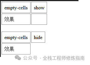
empty-cells – 是否显示空内容的单元格
描述: 此属性定义浏览器怎么来渲染显示 <table> 中没有可见内容的单元格的边框和背景。
语法参数:
/* Keyword values */
empty-cells: show;   /* 边框和背景正常渲染 */
empty-cells: hide;   /* 边框和背景被隐藏 */
示例演示:
<style>
/* 设置是否显示空内容的单元格: */
.table_1 { empty-cells: show; }
.table_2 { empty-cells: hide; }
td,
th {
  border: 1px solid gray;
  padding: 0.5rem;
}
</style>
<table class="table_1">
  <tr>
    <td>empty-cells</td>
    <td>show</td>
  </tr>
  <tr>
    <td>效果</td>
    <td></td>
  </tr>
</table>
<br />
<table class="table_2">
  <tr>
    <td>empty-cells</td>
    <td>hide</td>
  </tr>
  <tr>
    <td>效果</td>
    <td></td>
  </tr>
</table>
执行效果:
温馨提示: 在Github中有一个normalize.css小项目,它是一个现代的、支持HTML5的CSS重置替代方案,使浏览器渲染所有元素更加一致,并符合现代标准。简单的说就是一个CSS框架,可以用来快速美化我们所需的表单及表格,有兴趣的朋友可以看看。
 微信赞赏
微信赞赏 支付宝扫码领红包