CSS3基础知识之过渡动画
0x00 前言简述
描述: 在 CCS3 之前,通常是使用动画图片、Flash 动画或 JavaScript 的情况下,将元素从一种样式变换为另一种样式时为元素添加效果,可能要写一堆的代码;所以在 CSS3 中提供了过渡transition (英 [træn’zɪʃ ə n, -‘sɪ-],n. 过渡;转变;[分子生物] 转换;变调)与动画(animation)两个属性,极大的方便前端开发者做出一个好看、且丝滑流畅的网页动画界面,给浏览者一个良好的浏览体验。
动画及过渡效果属性一览:
-
transition: 指定过渡效果,它是下述四个子CSS属性的简写 -
transition-property: 指定哪个或哪些 CSS 属性用于过渡。只有指定的属性才会在过渡中发生动画,其他属性仍如通常那样瞬间变化。 -
transition-duration: 指定过渡的时长, 你可以为所有属性指定一个值,或者指定多个值,或者为每个属性指定不同的时长。 -
transition-delay: 指定延迟,即属性开始变化时与过渡开始发生时之间的时长。 -
transition-behavior:指定动画行为为离散的属性是否启动转换。 -
transition-timing-function: 指定一个函数,定义属性值怎么变化, 缓动函数定义属性如何计算, 大多数缓动函数由四点定义一个立方贝塞尔曲线, 也可以从 Easing Functions Cheat Sheet 选择缓动效果。 -
animation:指定动画效果,同样它是下述八个子CSSS属性的简写 -
animation-delay:设置延时,即从元素加载完成之后到动画序列开始执行的这段时间。 -
animation-direction:设置动画在每次运行完后是反向运行还是重新回到开始位置重复运行。 -
animation-duration:设置动画一个周期的时长。 -
animation-iteration-count:设置动画重复次数,可以指定 infinite 无限次重复动画 -
animation-name:指定由@keyframes描述的关键帧名称。 -
animation-play-state:允许暂停和恢复动画。 -
animation-timing-function:设置动画速度,即通过建立加速度曲线,设置动画在关键帧之间是如何变化。 -
animation-fill-mode:指定动画执行前后如何为目标元素应用样式。
温馨提示:作者最近开通的知识星球,全栈系列从门到实践教程将会逐步同步到星球内,加入星球将获得作者在安全、运维、开发中的所有学习实践笔记,和问题答疑以及远程技术支持,希望大家多多支持!

0x01 过渡 (transition) 讲解
1.transition-property 属性 – 规定应用过渡的CSS属性名称
描述: 此属性是指定哪个或哪些 CSS 属性用于过渡,它是必须的。
语法参数:
# 语法
transition-property: none|all|property;

# 参数
none:没有过渡动画。
all:所有可被动画的属性都表现出过渡动画。
IDENT:属性名称,由小写字母 a 到 z,数字 0 到 9,下划线(_)和破折号(-)。
2.transition-duration 属性 – 规定过渡效果所花费的时间
描述:此属性是指定完成过渡效果需要花费的时间(以秒s或毫秒计ms,1000ms = 1s),缺省值 0。
语法参数:
# 语法
transition-duration: 10s, 30s, 230ms;

# 参数
time: 表示过渡属性从旧的值转变到新的值所需要的时间, 不接受负值。
示例演示:
示例1.规定应用过渡的CSS属性名称以及过渡所耗费时间。
<style>
.box {
border-style: solid;
border-width: 1px;
display: block;
width: 100px;
height: 100px;
background-color: #ff11cc;
transition-property: background-color, width, height, rotate, opacity, text-orientation; /* 关键点:指定需要过渡的属性” */
transition-duration: 2s, 5s, 3s, 5s, 4s, 2s; /* 关键点:分别设置过渡时间 */
}
.box:hover {
background-color: #ffcccc;
width: 150px;
height: 150px;
rotate: 180deg;
opacity: 0.4;
writing-mode: vertical-rl;
text-orientation: sideways-right; /* 竖立显示文字 */
}
</style>
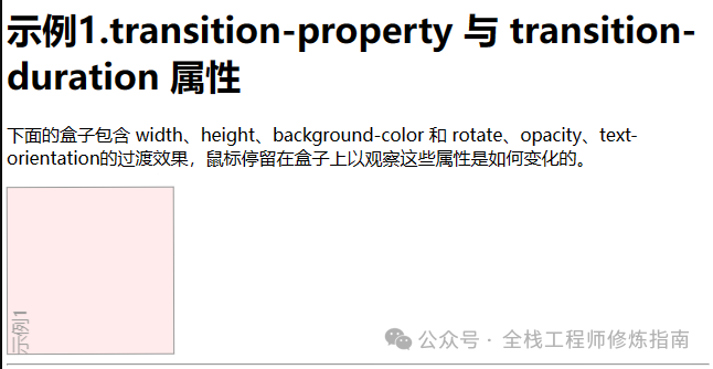
<h1>示例1.transition-property 与 transition-duration 属性 </h1>
<p>
下面的盒子包含 width、height、background-color 和 rotate、opacity、text-orientation的过渡效果,鼠标停留在盒子上以观察这些属性是如何变化的。
</p>
<div class="box">示例1</div>
3.transition-delay 属性 – 规定过渡效果从何时开始
描述: 此属性规定了在过渡效果开始作用之前需要等待的时间,值以秒(s)或毫秒(ms)为单位,表明动画过渡效果将在何时开始。
语法参数:
# 语法
transition-delay: 2s, 4ms;

# 参数
time: 表明动画效果属性生效之前需要等待的时间。
4.transition-timing-function 属性 – 规定过渡效果的时间曲线
描述: 此属性指定函数建立一条加速度曲线,从而允许过渡效果随着时间来改变其速度。
语法参数:
# 语法
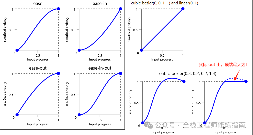
transition-timing-function: linear | ease | ease-in | ease-out |ease-in-out | cubic-bezier(n,n,n,n);
# 参数
inear 均衡(缺省)
ease 先慢后快再慢,ease:英 [iːz] 美 [iz] vt. 减轻,缓和;使安心 n. 轻松,舒适;安逸,悠闲
ease-in 先慢后快
ease-out 先快后慢
ease-in-out 先慢后快再慢
cubic-bezier(n,n,n,n) 贝塞尔曲线 (<x1>, <y1>, <x2>, <y2>)
# 立方贝塞尔(0.1,0.7,1.0,0.1)/* <0,1> 范围内四个<number>的正则Bézier曲线 */
# 立方贝塞尔(0,0,1,1) /* 使用<integer>是有效的,因为任何<integer]也是<number> */
# 立方贝塞尔(0.1,-0.6,0.2,0) /* 坐标的负值是有效的,会导致反弹效果 */
# 立方贝塞尔(0,1.1,0.8,4) /* 大于1.0的纵坐标值也是有效的 */
transition-timing-function: ease, step-start, cubic-bezier(0.1, 0.7, 1, 0.1); /* 多个时间函数 */
示例演示:
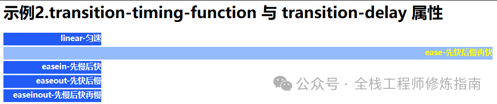
示例1.测试不同的 transition-timing-function 与延迟执行属性值达到的效果。
<style  media="screen">
.demo1 {
  height: 26px;
  width: 200px;
  text-align: right;
  color:white;
  background-color: rgb(35, 91, 247);
  font-weight: bold;
  margin-top: 3px;
  transition-duration: 3s, 2s;                         /* 过渡时间2秒 */
  transition-property: width, color,background-color;  /* 过渡属性 */
  transition-delay: 1s,2s,1s;                          /* 过渡延迟1秒 */
}

.demo1:hover {
  width: 1000px;
  color: #fffb00;
  background-color: rgba(93, 154, 247, 0.658);
}

.linear {transition-timing-function: linear;}
.ease {transition-timing-function: ease;}
.easein {transition-timing-function: ease-in;}
.easeout {transition-timing-function: ease-out;}
.easeio {transition-timing-function: ease-in-out;}
</style>
<div class="demo1 linear">linear-匀速</div>
<div class="demo1 ease">ease-先快后慢再快</div>
<div class="demo1 easein">easein-先慢后快</div>
<div class="demo1 easeout">easeout-先快后慢</div>
<div class="demo1 easeio">easeinout-先慢后快再慢</div>
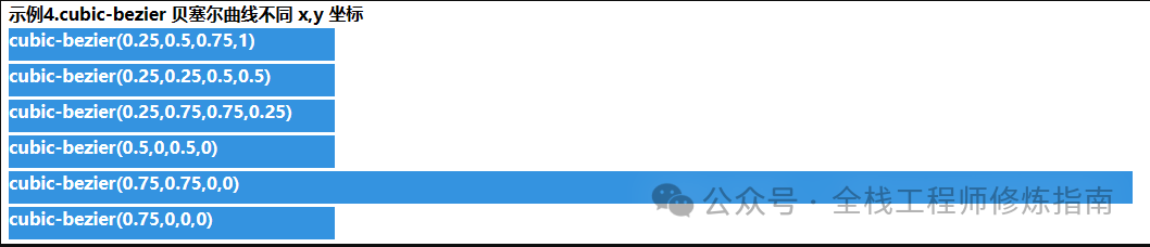
示例2.采用 cubic-bezier 函数规定更多运行轨迹,值越小、越快。
<style type="text/css">
.e1l,.e2l,.e3l,.e4l,.e5l,.e6l {
  margin-top:3px;
  height: 30px;
  width: 300px;
  color:white;
  background-color:rgb(52, 147, 224);
  font-weight:bold;
  transition-duration:2s;
  transition-property:width;
}
.e1l {transition-timing-function:cubic-bezier(0.25,0.5,0.75,1);}
.e2l {transition-timing-function:cubic-bezier(0.25,0.25,0.5,0.5);}
.e3l {transition-timing-function:cubic-bezier(0.25,0.75,0.75,0.25);}
.e4l {transition-timing-function:cubic-bezier(0.5,0,0.5,0);}
.e5l {transition-timing-function:cubic-bezier(0.75,0.75,0,0);}
.e5l {transition-timing-function:cubic-bezier(0.75,0,0,0);}
div:hover {
  width: 1200px;
}
</style>
<b>示例3.cubic-bezier 贝塞尔曲线不同 x,y 坐标效果</b>
<div class="e1l">cubic-bezier(0.25,0.5,0.75,1)</div>
<div class="e2l">cubic-bezier(0.25,0.25,0.5,0.5)</div>
<div class="e3l">cubic-bezier(0.25,0.75,0.75,0.25)</div>
<div class="e4l">cubic-bezier(0.5,0,0.5,0)</div>
<div class="e5l">cubic-bezier(0.75,0.75,0,0)</div>
<div class="e6l">cubic-bezier(0.75,0,0,0)</div>
5.transition 属性 – 规定过渡效果
描述: transition 简写属性 CSS 语法如下:transition: <property> <duration> <timing-function> <delay>;。
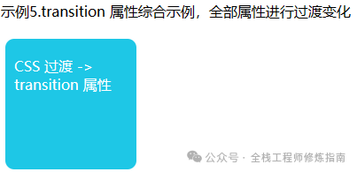
示例演示:示例1.transition 属性综合示例,全部属性进行过渡变化, 进行旋转外加更改字体、宽高大小。
<style>
.transition_div {
  width:128px;
  height:68px;
  background:#92B901;
  color:#ffffff; font-weight:bold;
  font:12px '微软雅黑';
  padding:20px 10px 0px 10px;
  float:left;
  margin:5px;
  border-radius:10px;
  opacity:0.4;
  transition: all 2s cubic-bezier(0.25,0.9,0.75,0.85) 1s;
}

.transition_div:hover{
  transform: rotate(360deg); /* 变换(旋转) */
  opacity:1;                 /* 透明度 */
  background-color:#1ec7e6;
  font-size:16px;
  width:128px;
  height:128px;
}
</style>
<p>示例5.transition 属性综合示例,全部属性进行过渡变化</p>
<p class="transition_div">CSS 过渡 -> transition 属性</p>
6.transition-behavior 属性 – 规定动画行为为离散的属性是否启动转换
描述:此CSS属性指定动画行为为离散的属性是否启动转换。
语法参数:
# 语法
transition-behavior: allow-discrete;
transition-behavior: normal;

# 参数
normal:对于离散动画属性,不会在元素上启动转换。
allow-discrete:对于离散动画属性,将在元素上开始转换。
示例演示:
示例1.转换行为属性仅在与其他转换属性(尤其是转换属性和转换持续时间)一起使用时才相关,因为如果在非零持续时间内没有为任何属性设置动画,则不会发生转换。
.card {
  transition-property: opacity, display;
  transition-duration: 0.25s;
  transition-behavior: allow-discrete;
}

.card.fade-out {
  opacity: 0;
  display: none;
}
转换行为值可以作为简写转换声明的一部分包含在内。当包含在简写中时,当使用或默认为所有属性时,允许离散值对常规可设置动画的属性没有影响。
以下CSS等效于上面的声明:
.card {
  transition: all 0.25s;
  transition: all 0.25s allow-discrete;
}

.card.fade-out {
  opacity: 0;
  display: none;
}
0x02 动画 (animations) 讲解
描述:CSS animations 使得可以将从一个 CSS 样式配置转换到另一个 CSS 样式配置,动画包括两个部分:@keyframes 描述动画的样式规则和 from、to 用于指定动画开始、结束以及中间点样式的关键帧, 使用 animation-name 指定关键帧的名称。
温馨提示:相较于传统的JS脚本实现动画技术,使用 CSS 动画有三个主要优点:
-
非常容易地创建简单动画,你甚至不需要了解 JavaScript 就能创建动画。 -
动画运行效果良好,甚至在低性能的系统上。渲染引擎会使用跳帧或者其他技术以保证动画表现尽可能的流畅。而使用 JavaScript 实现的动画通常表现不佳(除非经过很好的设计)。 -
让浏览器控制动画序列,允许浏览器优化性能和效果,如降低位于隐藏选项卡中的动画更新频率。
温馨提示:为了使动画进行浮动,我们可以采用 position: relative 属性规定对象。
1.animation-name 属性 – 指定动画名称
2.animation-duration 属性 – 指定动画耗时
3.animation-iteration-count 属性 – 指定动画重复次数
语法参数:
/* # 使用 @keyframes 规则,创建动画  */
@keyframes animationname {keyframes-selector {css-styles;}}
/* 参数 */
animationname 自定义动画名称
keyframes-selector 动画时长百分比
css-styles CSS 动画样式

/* #为 @keyframes 动画规定名称。 */
animation-name: keyframename|none;

/* 定义动画完成一个周期所需要的时间,以秒或毫秒计。*/
animation-duration: time;

/* 定义动画的播放次数,默认一次。*/
animation-iteration-count: number | infinite;
/* 参数 */
n        自定义动画播放的数值
infinite 规定动画无限次播放
温馨提示:以百分比来规定改变发生的时间,或者通过关键词 “from” 和 “to”,等价于 0% 和 100%,0% 是动画的开始时间,100% 动画的结束时间,注意为了获得最佳的浏览器支持,您应该始终定义 0% 和 100% 选择器。
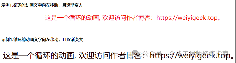
示例演示:示例1.该例中<p>元素由浏览器窗口右边滑至左边从开始到结束耗费 3 秒。
<b>示例1.循环的动画文字向左移动,且逐渐变大。</b>
<style>
.demo1 {
  animation-duration: 3s;
  animation-name: slidein;
  animation-iteration-count: infinite;
}

@keyframes slidein {
  from {
    margin-left: 100%;
    width: 300%;
  }
  75% {
    font-size: x-large;
    color: red;
  }
  to {
    margin-left: 0%;
    width: 100%;
    font-size: xx-large;
  }
}
</style>
<p class="demo1">
  这是一个循环的动画, 欢迎访问作者博客:https://weiyigeek.top。
</p>
执行结果:
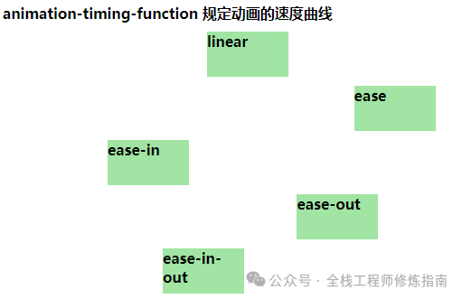
4.animation-timing-function 属性 – 规定动画的速度曲线
描述: 此属性与 transition 中的 transition-timing-function 属性值是一样,同样也可使用名为三次贝塞尔(Cubic Bezier)函数的数学函数,来生成速度曲线,。
语法参数:
animation-timing-function: linear | ease (低速、块、变慢) | ease-in | ease-out | ease-in-out| cubic-bezier(0,0,0.25,1);
示例演示:示例.为加深地理解不同的定时函数值,这里提供了设置五个不同值的五个不同的 div 元素。
<b>示例.animation-timing-function 规定动画的速度曲线</b>
<style media="screen">
  .linear,.ease,.easein,.easeout,.easeit {
    width: 90px;
    height: 50px;
    background-color: #A1e4a3;
    font-weight: bold;
    position: relative !important;
    animation-name: timing;
    animation-duration: 5s;
    animation-iteration-count: infinite;
    margin-top: 10px;
  }
    /**贝塞尔曲线*/
  .linear {animation-timing-function: linear;}
  .ease {animation-timing-function:ease;}
  .easein {animation-timing-function:ease-in;}
  .easeout {animation-timing-function:ease-out;}
  .easeit {animation-timing-function:ease-in-out;}

  @keyframes timing {
    from {left: 0px;}
    to {left: 600px;}
  }

</style>
<div class="linear">linear - 线性</div>
<div class="ease">ease - 先快后慢</div>
<div class="easein">ease-in - 慢快慢</div>
<div class="easeout">ease-out - 快慢</div>
<div class="easeit">ease-in-out - 慢快慢</div>
5.animation-delay 属性 – 规定动画何时开始
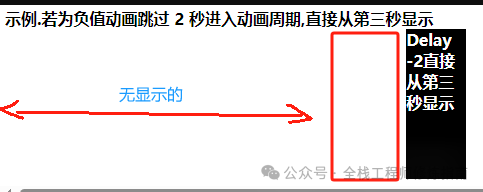
描述:此属性定义动画何时开始,其值以秒或毫秒计,值得注意的是它是允许负值的,-2s 使动画马上开始,但跳过 2 秒进入动画。
语法参数:
animation-delay: time;
示例演示:
<b>示例.若为负值动画跳过 2 秒进入动画周期,直接从第三秒显示</b>
<style type="text/css" media="screen">
  .delay {
    width: 60px;
    height: 150px;
    background:black;
    font-weight: bold;
    color: white;

    position: relative; /*注意这里*/
    animation: test 5s 1;
    animation-delay: -2s;  /**注意这里**/
  }

  @keyframes test {
    from {left: 0px;}
    to {left: 500px;}
  }
</style>
<div class="delay">Delay -2直接从第三秒显示</div>
执行结果:
6.animation-direction 属性 – 规定动画是否在下一周期逆向地播放
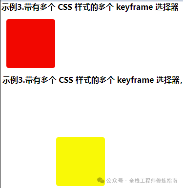
描述: 此属性定义是否应该轮流反向播放动画,如果 animation-direction 值是 “alternate”,则动画会在奇数次数(1、3、5 等等)正常播放,而在偶数次数(2、4、6 等等)向后播放。
温馨提示:若把动画设置为只播放一次,则该属性没有效果。
语法参数:
animation-direction: normal | alternate;
/* 参数 */
normal: 正常播放
alternate: 轮流反向播放
示例演示:示例.带有多个 CSS 样式的多个 keyframe 选择器,实现从上下左右的循环移动,并变换颜色。
<b>示例3.带有多个 CSS 样式的多个 keyframe 选择器,实现从上下左右的循环移动,并变换颜色</b>
<style>
div.demo3 {
  margin: 10px;
  width:100px;
  height:100px;
  background:red;
  color: white;
  border-radius: 5px;
  position:relative;
  animation-name:multi;  /**引入标识符号**/
  animation-duration:5s;
  animation-timing-function:linear;
  animation-delay:2s;
  animation-iteration-count:infinite;
  animation-direction:alternate;
  animation-play-state:running;
}
@keyframes multi{  /**这是一个上下左右的循环移动*/
  0%   {top:0px; left:0px; background:red;}
  25%  {top:0px; left:100px; background:blue;}
  50%  {top:100px; left:100px; background:yellow;}
  75%  {top:100px; left:0px; background:green;}
  100% {top:0px; left:0px; background:red;}
}
</style>
<div class="demo3"> </div>
执行结果:
7.animation 属性 – 规定动画的全部属性
描述: 此属性为除 animation-play-state 与 animation-fill-mode 属性之外的简写,极大的减少代码量
语法参数:
animation: name duration timing-function delay iteration-count direction;

/* 不同浏览器动画属性的写法 */
/* Normal */
animation: myfirst 5s linear 2s infinite alternate;
/* Firefox: */
-moz-animation: myfirst 5s linear 2s infinite alternate;
/* Safari 和 Chrome: */
-webkit-animation: myfirst 5s linear 2s infinite alternate;
/* Opera: */
-o-animation: myfirst 5s linear 2s infinite alternate;
示例演示:
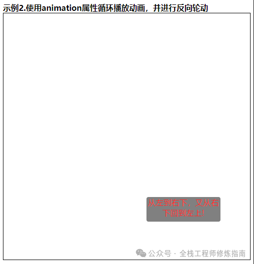
示例1.使用animation属性循环播放动画,并进行反向轮动。
<b>示例2.使用animation属性循环播放动画,并进行反向轮动</b>
<style type="" media="screen">
  .border_1 {
    height: 500px;
    width: 500px;
    border: 1px solid black;
  }
  .demo2 {
    width: 150px;
    height: 50px;
    text-align: center;
    background: gray;
    color: white;
    position:relative;                 /* !important; 设置为相对位置 */
    border-radius: 4px;
    animation:top-to-down 3.5s cubic-bezier(0.25, 0.46, 0.45, 0.94) 1s infinite alternate;
  }
  @keyframes top-to-down {
    from {top:0px;left : 0px;}
    to {top:450px;left: 350px; color: red;}
  }
</style>
<div class="border_1">
  <div class="demo2">从左到右下,又从右下回到左上!</div>
</div>
执行结果:
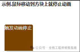
8.animation-play-state 属性 – 规定动画正在运行还是暂停
描述: 此属性规定动画正在运行还是暂停;您可以在 JavaScript 中使用该属性,这样就能在播放过程中暂停动画。
语法参数:
animation-play-state: paused (停止) | running (播放);
示例演示:
<style>
.demo3 {
  width:100px;
  height:100px;
  background:red;
  position:relative;
  animation:mymove 5s infinite;
}
.demo3:hover{
  /* animation-play-state:running; */
  animation-play-state:paused;
}

@keyframes mymove{
  from {left:0px;}
  to {left:200px;}
}
</style>
<b>示例.鼠标移动到方块上就停止动画</b>
<div class="demo3">触发动画停止</div>
执行结果:
9.animation-fill-mode 属性 – 规定对象动画时间之外的状态
描述: 此属性规定动画在播放之前或之后,其动画效果是否可见, 其属性值是由逗号分隔的一个或多个填充模式关键词。
语法参数:
animation-fill-mode : none | forwards(保持最后关键帧中属性) | backwards(保持首个关键字中属性) | both;
综合示例:
示例1.兼容各浏览器,然后动画事件可以更好的控制动画和信息,温馨提示此处使用到了JS,简单了解即可。
<body>
<style>
.slidein {
-moz-animation-duration: 3s;
-webkit-animation-duration: 3s;
animation-duration: 3s;
-moz-animation-name: slidein;
-webkit-animation-name: slidein;
animation-name: slidein;
-moz-animation-iteration-count: 3;
-webkit-animation-iteration-count: 3;
animation-iteration-count: 3;
-moz-animation-direction: alternate;
-webkit-animation-direction: alternate;
animation-direction: alternate;
}
@-moz-keyframes slidein {
from {
margin-left: 100%;
width: 300%;
}
to {
margin-left: 0%;
width: 100%;
}
}
@-webkit-keyframes slidein {
from {
margin-left: 100%;
width: 300%;
}
to {
margin-left: 0%;
width: 100%;
}
}
@keyframes slidein {
from {
margin-left: 100%;
width: 300%;
}
to {
margin-left: 0%;
width: 100%;
}
}
</style>
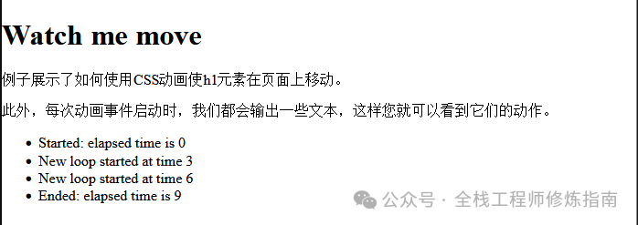
<h1 id="watchme">Watch me move</h1>
<p>
例子展示了如何使用CSS动画使h1元素在页面上移动。
</p>
<p>
此外,每次动画事件启动时,我们都会输出一些文本,这样您就可以看到它们的动作。
</p>
<ul id="output"></ul>
</body>
<script>
var e = document.getElementById("watchme");
e.addEventListener("animationstart", listener, false);
e.addEventListener("animationend", listener, false);
e.addEventListener("animationiteration", listener, false);
e.className = "slidein";
function listener(e) {
var l = document.createElement("li");
switch (e.type) {
case "animationstart":
l.innerHTML = "Started: elapsed time is " + e.elapsedTime;
break;
case "animationend":
l.innerHTML = "Ended: elapsed time is " + e.elapsedTime;
break;
case "animationiteration":
l.innerHTML = "New loop started at time " + e.elapsedTime;
break;
}
document.getElementById("output").appendChild(l);
}
</script>
执行结果:
本文至此完毕,更多技术文章,请关注我获取及时文章推送!
原文地址: https://blog.weiyigeek.top
扫码领红包 微信赞赏
微信赞赏 支付宝扫码领红包