CSS3基础知识之滚动吸附
0x00 前言简述
描述: CSS3中支持了滚动捕捉相对于提供类似功能的 JavaScript 库的关键优势,本文将来介绍 CSS3 滚动吸附(Scroll Snapping)的基本概念以及网页滚动条(Web Scroller Bar)的相关属性和实践演示,帮助各前端学习者了解一些冷知识,从而让你在设计交互式前端界面时更加游刃有余!。
那么什么CSS滚动吸附?
定义用户在滚动文档时自定义吸附位置以达到控制滑屏和滚动行为, 简单的说就是在用户完成滚动后将视口锁定到某些元素或位置。
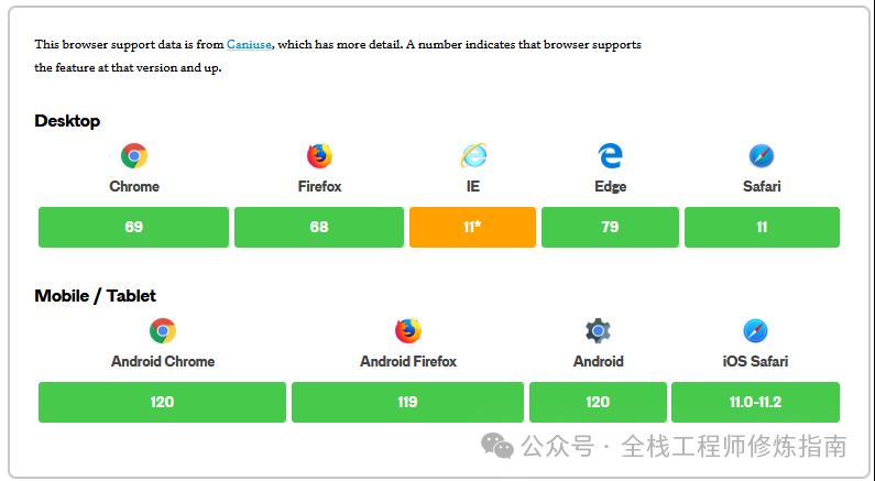
自2016年推出CSS滚动捕捉以来,越来越多的浏览器都是支持它的,例如 Google Chrome (69+)、Firefox、Edge 和 Safari,但是 IE11 是不支持的(PS:不过现在基本大家也逐步不使用IE了吧)
CSS滚动吸附相关属性:
-
scroll-snap-type – 可定义滚动式视口是否可被吸附、必须还是可选吸附以及吸附应当出现在哪些轴上。 -
scroll-snap-align – 设置在滚动容器的每个子元素上,可用于定义每个子元素的吸附位置或没有吸附位置。 -
scroll-snap-stop – 确保在滚动中吸附到而不是越过某个子元素。 -
scroll-margin – 设置在在滚动中可以被吸附的子元素上,用于在指定盒子上创建吸附外边距。 -
scroll-padding – 设置在滚动容器上,用于创建吸附偏移。
CSS滚动条相关属性:
-
overflow-x – 规定块级元素左右两侧显示内容 -
overflow-y – 规定块级元素上下两侧显示内容 -
overflow – 简写属性规定元素溢出时所需的行为 -
overflow-anchor – 规定退出浏览器滚动锚定行为 -
overflow-block – 规定内容溢出是块首和块末侧显示 -
overflow-inline – 规范内容溢出是行首和行末侧显示 -
overflow-wrap – 规定单词字符串溢出换行 -
overflow-clip-margin – 规定溢出受到裁剪的外边距 -
scrollbar-color – 规定滚动条演示 -
scrollbar-width – 规定滚动条宽度 -
scrollbar-gutter – 为滚动条保留空间
温馨提示:在定义滚动吸附前,需要在滚动容器启用 overflow 上启用滚动,并且为滚动容器指定尺寸。
0x01 CSS 滚动吸附属性
1.scroll-snap-type 属性 – 设置吸附轴与程度
描述:此属性设置了在有滚动容器的情形下吸附至吸附点的严格程度,但是此属性不为吸附至吸附点指定任何确切的动画或运动规律。
语法参数:
/* 不吸附 */
scroll-snap-type: none;
/* 表示吸附轴的关键字 */
scroll-snap-type: x;
scroll-snap-type: y;
scroll-snap-type: block;
scroll-snap-type: inline;
scroll-snap-type: both;
/* 表示吸附程度的可选关键字 */
/* mandatory 或 proximity */
scroll-snap-type: x mandatory;
scroll-snap-type: y proximity;
scroll-snap-type: both mandatory;
/* 参数: */
* x,y : 滚动容器仅在其横轴/纵轴上吸附至吸附位置。
* both: 滚动容器在其两轴上独立地吸附至吸附位置
* mandatory:告诉浏览器无论滚动到哪个位置,内容都必须吸附到特定的点
* proximity: 意味着内容可以吸附而不是必须吸附到点上
* block: 滚动容器仅在其块向轴上吸附至吸附位置
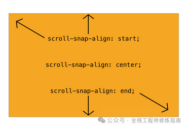
* inline:滚动容器仅在其行向轴上吸附至吸附位置2.scroll-snap-align 属性 – 规定滚动吸附位置
描述: 此属性的有效值包括 start、end、center 和 none, 这些值用于标示内容应当吸附到滚动容器中的哪个点,当设置为 none 或者未被设置(此时默认为 none),那么用户会无法把这个元素滚入视野。
语法参数:
/* 关键字值 */
scroll-snap-align: none;
scroll-snap-align: start end; /* 当设置两值时,第一值为块向,第二值为行向 */
scroll-snap-align: center;
以一张图来表示对齐点:
3.scroll-snap-stop 属性 – 规定是否越过吸附位置
描述: 此属性可以指定滚动容器是否可“越过”吸附位置, 在触摸板的设备上可以注意到此属性的影响,可试着用一次摆动滚动浏览所有项目,当值为“normal”应通过所有页面,而“always”将停止在第二页。
语法参数:
/* 关键字值 */
scroll-snap-stop: normal;
scroll-snap-stop: always;

/* 参数 */
* normal:在滚动此元素的滚动容器的可见视口时,滚动容器可“越过”吸附位置。
* always:滚动容器不得“越过”吸附位置,必须吸附至此元素的第一个吸附位置。
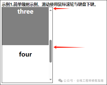
示例演示: 示例1.演示了由 scroll-snap-type 所定义的纵轴方向的滚动吸附
<style>
  .scroller {
    height: 300px;
    width: 200px;
    overflow-y: scroll;
    scroll-snap-type: y mandatory;
    border: 1px solid black;
    text-align: center;
  }
  .scroller section {
    scroll-snap-align: start;
    scroll-snap-stop: always;
    height: 150px;
  }
  .odd {
    color: white;
    background-color: gray;
  }
</style>
<b>示例1.简单吸附示例,滑动使用鼠标滚轮与键盘下键。</b>
<div class="scroller">
  <section class="odd"><h2>one</h2></section>
  <section><h2> two</h2></section>
  <section class="odd"><h2> three</h2></section>
  <section><h2> four</h2></section>
  <section class="odd"><h2> five</h2></section>
</div>
执行结果:
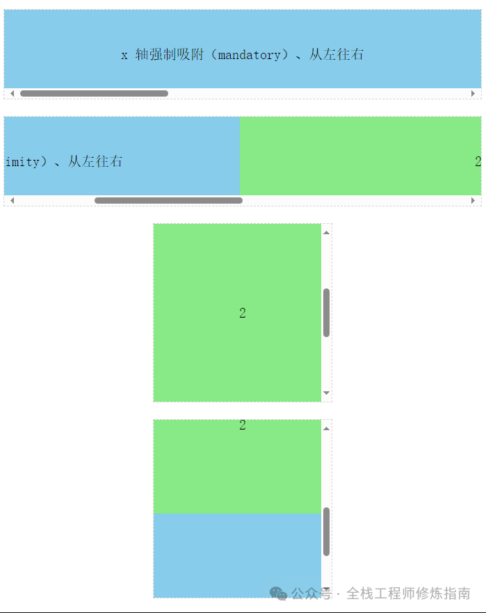
示例2.强制吸附与靠近吸附,以及不同X,Y轴方向的滚动吸附。
<body>
 <style>
  .holster {
    display: flex;
    align-items: center;
    justify-content: space-between;
    flex-flow: column nowrap;
    font-family: monospace;
  }
  .container {
    display: flex;
    margin: 1em auto;
    outline: 1px dashed lightgray;
    flex: none;
    overflow: auto;
  }
  .container.x {
    width: 100%;
    height: 128px;
    flex-flow: row nowrap;
    overflow-y: hidden;
  }
  .container.y {
    width: 256px;
    height: 256px;
    flex-flow: column nowrap;
    overflow-x: hidden;
  }

  /* 滚动吸附 */
  .x.mandatory-scroll-snapping {
    scroll-snap-type: x mandatory;
  }
  .y.mandatory-scroll-snapping {
    scroll-snap-type: y mandatory;
  }
  .x.proximity-scroll-snapping {
    scroll-snap-type: x proximity;
  }
  .y.proximity-scroll-snapping {
    scroll-snap-type: y proximity;
  }

  .container > div {
    text-align: center;
    scroll-snap-align: center;
    flex: none;
  }

  .x.container > div {
    line-height: 128px;
    font-size: 20px;
    width: 100%;
    height: 128px;
  }
  .y.container > div {
    line-height: 256px;
    font-size: 20px;
    width: 256px;
    height: 100%;
  }

  /* 修补外观 */
  .y.container > div:first-child {
    line-height: 1;
    font-size: 25px;
    color: white;
  }

  /* 上色 */
  .container > div:nth-child(even) {
    background-color: #87ea87;
  }
  .container > div:nth-child(odd) {
    background-color: #87ccea;
  }

  /* 在子元素上定义滚动吸附定格 */
  .always-stop > div {
    scroll-snap-stop: always;
  }
  .normal-stop > div {
    scroll-snap-stop: normal;
  }
  </style>
  <div class="holster">
    <div class="container x mandatory-scroll-snapping" dir="ltr">
      <div>x 轴强制吸附(mandatory)、从左往右</div>
      <div>2</div>
      <div>3</div>
    </div>
    <div class="container x proximity-scroll-snapping" dir="ltr">
      <div>x 轴靠近吸附(proximity)、从左往右</div>
      <div>2</div>
      <div>3</div>
    </div>
    <div class="container y mandatory-scroll-snapping always-stop" dir="ltr">
      <div>y 轴强制吸附(mandatory)、从左往右、always-stop</div>
      <div>2</div>
      <div>3</div>
    </div>
    <div class="container y proximity-scroll-snapping normal-stop" dir="ltr">
      <div>y 轴靠近吸附(proximity)、从左往右、normal-stop</div>
      <div>2</div>
      <div>3</div>
    </div>
    <div class="container x mandatory-scroll-snapping" dir="rtl">
      <div>x 轴强制吸附(mandatory)、从右往左</div>
      <div>2</div>
      <div>3</div>
    </div>
    <div class="container x proximity-scroll-snapping" dir="rtl">
      <div>x 轴靠近吸附(proximity)、从右往左</div>
      <div>2</div>
      <div>3</div>
    </div>
    <div class="container y mandatory-scroll-snapping" dir="rtl">
      <div>y 轴强制吸附(mandatory)、从右往左</div>
      <div>2</div>
      <div>3</div>
    </div>
    <div class="container y proximity-scroll-snapping" dir="rtl">
      <div>y 轴靠近吸附(proximity)、从右往左</div>
      <div>2</div>
      <div>3</div>
    </div>
  </div>
</body>
4.scroll-margin 属性 – 规定滚动吸附外边距
描述: 此属性设置元素的所有滚动外边距,简单的而说,其指定的值决定了页面主要位于吸附口外的多少部分应保持可见。
其赋值方式较为类似 margin 属性为元素外边距赋值的方式, 它也是 scroll-margin-bottom、left、right、top 属性的简写模式。。
语法参数:
/* <length> 值 */
scroll-margin: 10px;
scroll-margin: 1em 0.5em 1em 1em;
5.scroll-padding 属性 – 规定滚动吸附内边距
描述: 此属性设置元素的所有滚动内边距,其赋值方式较为类似 padding 属性为元素内边距赋值的方式,它也是 scroll-padding-bottom、left、right、top 属性的简写模式。
语法参数:
/* 关键字值 */
scroll-padding: auto;

/* <length> 值 */
scroll-padding: 10px;
scroll-padding: 1em 0.5em 1em 1em;
scroll-padding: 10%;
示例演示:
-
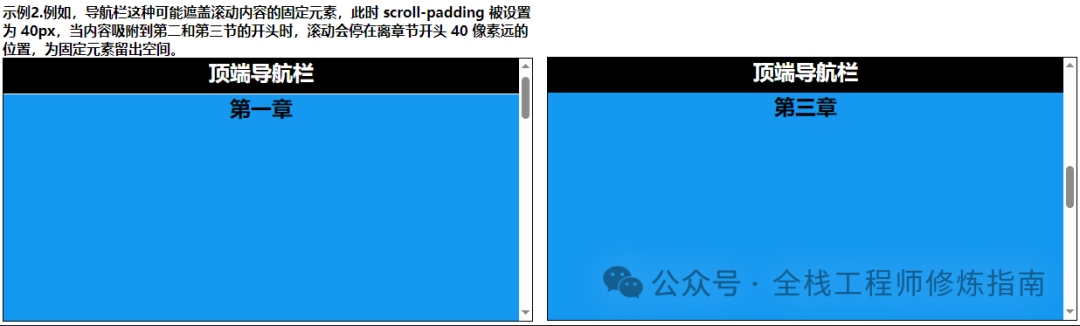
示例1.例如,导航栏这种可能遮盖滚动内容的固定元素,此时 scroll-padding被设置为 40px,当内容吸附到第二和第三节的开头时,滚动会停在离章节开头 40 像素远的位置,为固定元素留出空间。
<style>
.scroller_demo {
  border: 1px solid black;
  text-align: center;
  height: 300px;
  overflow-y: scroll;
  scroll-snap-type: y mandatory;  /* 强制吸附 */
  scroll-padding: 40px;   /* 关键点 */
}
.scroller_demo h1 {
  position: sticky;       /* 关键点 */
  top: 0;
  margin: 0;
  padding: 0;
  min-height: 40px;
  background-color: #000;
  color: #fff;

}
.scroller_demo section {
  scroll-snap-align: start;
  height: 300px;
}
.scroller_demo section:nth-child(even) {
  background-color: #1598f0;
}
</style>
<article class="scroller_demo">
  <h1>顶端导航栏</h1>
  <section> <h2>第一章</h2> </section>
  <section> <h2>第二章</h2> </section>
  <section> <h2>第三章</h2> </section>
  <section> <h2>第四章</h2> </section>
  <section> <h2>第五章</h2> </section>
</article>
执行结果:
-
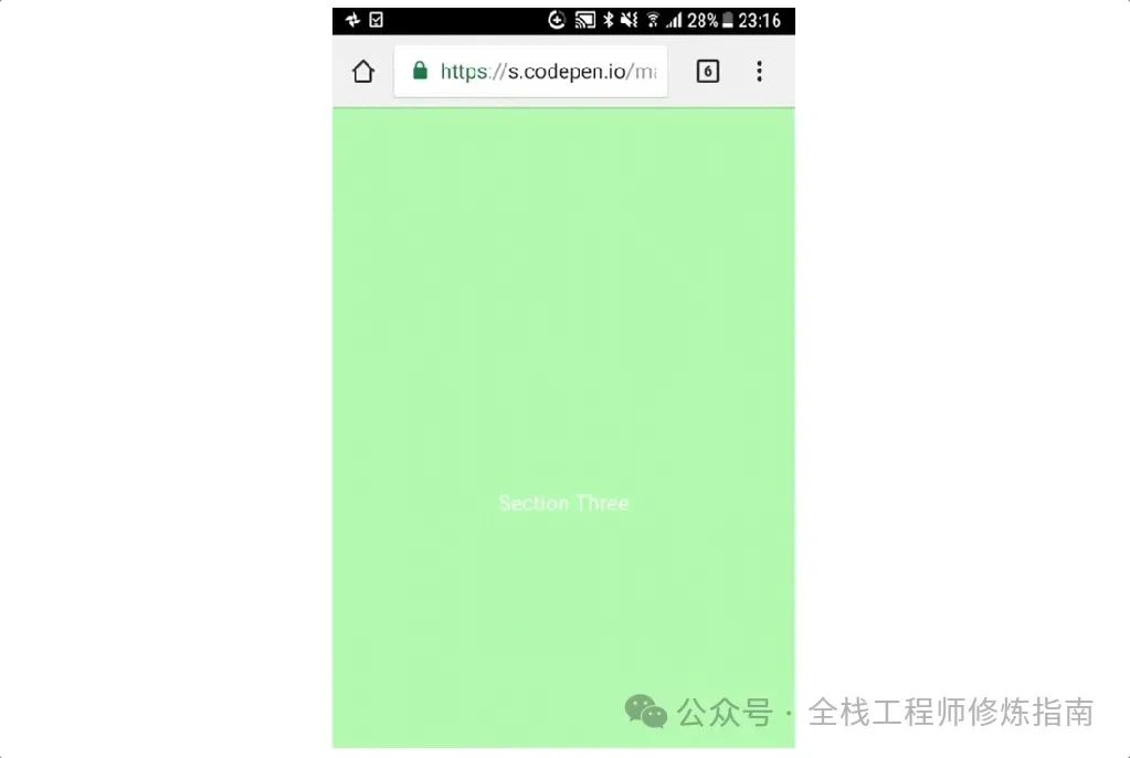
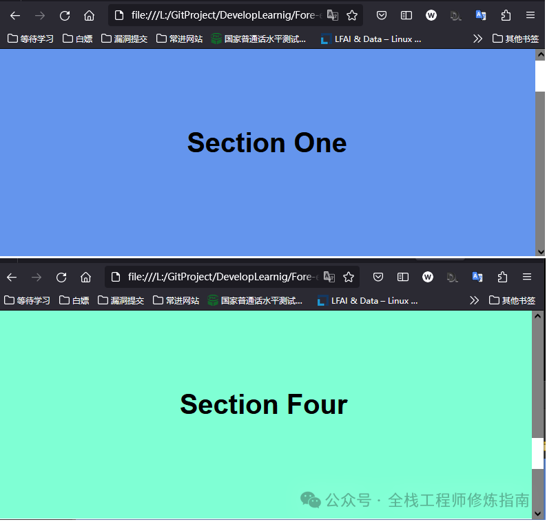
示例2.垂直全屏吸附,将每个部分设置为视口的大小,并将上边缘定义为捕捉点。
<body>
<style>
  * {
    box-sizing: border-box;
    margin: 0;
    padding: 0;
    scrollbar-color: white gray;
  }
  html {
    font-family: sans-serif;
    scroll-snap-type: y mandatory;   /* 关键点 */
  }
  section {
    border-bottom: 1px solid white;
    padding: 1rem;
    height: 100vh;
    text-align: center;
    scroll-snap-align: start; /* 关键点 */
    position: relative;       /* 关键点 */
  }
  h1 {
    position: absolute;
    top: 45%;
    transform: translateY(-50%);
    text-align: center;
    color: black;
    width: 100%;
    left: 0;
    font-size: calc(1rem + 3vw); /* 值得学习 */
  }
  section:nth-child(odd) {
    background-color:aquamarine;
  }
  section:nth-child(even) {
    color: white;
    background-color:cornflowerblue;
  }
  </style>
  <section><h1>Section One</h1></section>
  <section><h1>Section Two</h1></section>
  <section><h1>Section Three</h1></section>
  <section><h1>Section Four</h1></section>
  <section><h1>Section Five</h1></section>
</body>
执行结果:
-
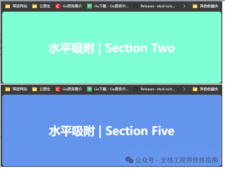
示例3.水平全屏吸附,使用键盘⌨ →键测试吸附。
<body>
  <style>
    * {
      box-sizing: border-box;
      margin: 0;
      padding: 0;
    }

    body {
      overflow-y: hidden;
    }

    .slider {
      font-family: sans-serif;
      display: flex;
      -webkit-overflow-scrolling: touch;
      overflow-x: scroll;
      scroll-snap-type: x mandatory;
    }

    section {
      border-right: 1px solid white;
      padding: 1rem;
      min-width: 100vw;
      height: 100vh;
      scroll-snap-align: start;
      text-align: center;
      position: relative;
    }

    h1 {
      position: absolute;
      top: 50%;
      transform: translateY(-50%);
      text-align: center;
      color: white;
      width: 100%;
      left: 0;
      font-size: calc(1rem + 3vw);
    }

    section:nth-child(even) {
      background-color: aquamarine;
    }

    section:nth-child(odd) {
      color: white;
      background-color: cornflowerblue;
    }
  </style>
  <div class="slider">
    <section>
      <h1>水平吸附 | Section One</h1>
    </section>
    <section>
      <h1>水平吸附 | Section Two</h1>
    </section>
    <section>
      <h1>水平吸附 | Section Three</h1>
    </section>
    <section>
      <h1>水平吸附 | Section Four</h1>
    </section>
    <section>
      <h1>水平吸附 | Section Five</h1>
    </section>
  </div>
</body>
执行结果:
参考文章: 实用的 CSS 滚动捕捉
0x02 CSS 滚动条属性
描述: 当我们垂直或水平内容超过视口宽度时, 往往会出现 Vertical、Horizontal 滚动的滚动条,当我们下滑时滚动条会显示滑动的进度,从而提示用户已经到底了,那在Web 3.0的今天为了给用户更好的使用体验,在某些场景中往往需要自定义是否显示滚动条以及其样式的设置,所以此小节立足于实践演示进度条相关属性。
1.overflow-x 属性 – 规定块级元素左右两侧显示内容
2.overflow-y 属性 – 规定块级元素上下两侧显示内容
3.overflow 属性 – 简写属性规定元素溢出时所需的行为
描述: 此属性是 overflow-x (设置当内容溢出块级元素的左右两侧时所显示的内容) 、overflow-y (设置当内容溢出块级元素的上下两侧时所显示的内容) 属性的简写属性,其设置了元素溢出时所需的行为,即当元素的内容太大而无法适应它的块级格式化上下文时,应该是显示,或者隐藏,或剪切。
语法参数:
/* Keyword values */
overflow: visible;
overflow: hidden;
overflow: clip;
overflow: scroll;
overflow: auto;
overflow: hidden visible;
overflow-x: 参数同上;
overflow-y: 参数同上;

/* 参数解析: */
visible: 内容不能被裁减并且可能渲染到边距盒(padding)的外部。
hidden: 隐藏滚动条。
clip:类似于 hidden,内容将以元素的边距(padding)盒进行裁剪。
scroll:以滚动的方式显示多余内容,即内容将被裁减以适应边距(padding)盒。
auto:自适应,如果内容适应边距(padding)盒,它看起来与 visible 相同;若内容溢出,则浏览器提供滚动条。
温馨提示:当 overflow-y 的值为 hidden、scroll 或者 auto,而 overflow-x 属性的值为 visible(默认值)时,该值会被隐式地计算为 auto,同样的当 overflow-x 值为上述值时,overflow-x 值为 visible(默认值)时,该值会被隐式地计算为 auto。
4.overflow-anchor 属性 – 规定退出浏览器滚动锚定行为
描述: 此属性提供一种退出浏览器滚动锚定行为的方法,该行为会调整滚动位置以最大程度地减少内容偏移。
默认情况下,在任何支持滚动锚定行为的浏览器中都将其启用。因此,仅当你在文档或文档的一部分中遇到滚动锚定问题并且需要关闭行为时,才通常需要更改此属性的值。
语法参数:
/* Keyword values */
overflow-anchor: auto;  /* 当调整滚动位置时,该元素将成为潜在的锚点。 */
overflow-anchor: none;  /* 防止在文档中滚动锚定,请使用溢出锚定属性。*/
5.overflow-block 属性 – 规定内容溢出是块首和块末侧显示
6.overflow-inline 属性 – 规范内容溢出是行首和行末侧显示
描述: overflow-block 属性设置了当内容溢出盒的块首和块末侧时所显示的内容,而overflow-inline 属性则是当内容溢出盒的行首和行末侧时所显示的内容,可以不显示或者显示滚动条或溢出内容。
语法参数:
/* 关键词值 */
overflow-block|inline: visible; /* 不裁剪内容且可在内边距盒的块首和块末侧外渲染内容。*/
overflow-block|inline: hidden;  /* 隐藏溢出的内容。 */
overflow-block|inline: scroll;
overflow-block|inline: auto;
7.overflow-wrap 属性 – 规定单词字符串溢出换行
描述: 应用于行级元素,用来设置浏览器是否应该在一个本来不能断开的字符串中插入换行符,以防止文本溢出其行向盒。
温馨提示: 与 word-break 相比,overflow-wrap 仅在无法将整个单词放在自己的行而不会溢出的情况下才会产生换行。
语法参数:
/* 关键词值 */
overflow-wrap: normal;   /* 只能在正常的单词断点(例如两个单词之间的空格)处换行 */
overflow-wrap: anywhere; /* 防止溢出,如果行中没有其他可接受的断点,则不可断的字符串(如长词或 URL)可能会在任何时候换行。*/
overflow-wrap: break-word; /* 类似 anywhere 如果行中没有其他可接受的断点,则允许在任意点将通常不可断的单词换行。*/
示例演示:
-
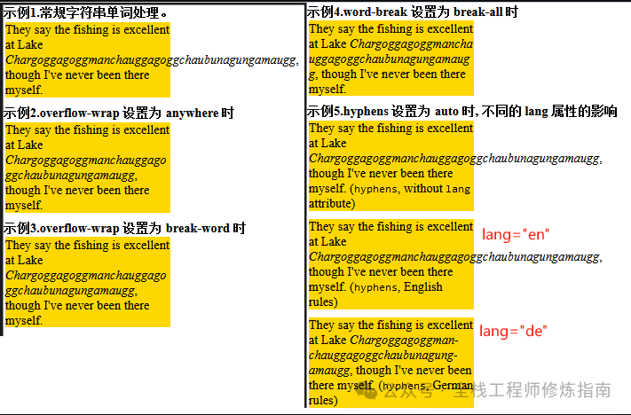
示例1.比较分解长单词时设置 overflow-wrap、word-break、hyphens 属性的结果。
<style>
p {
  width: 13em;
  margin: 2px;
  background: gold;
  margin-bottom: 10px;
}
.ow-anywhere {
  overflow-wrap: anywhere;
}
.ow-break-word {
  overflow-wrap: break-word;
}
.word-break {
  word-break: break-all;
}
.hyphens {
  hyphens: auto;
}
</style>
<b> 示例1.常规字符串单词处理。</b>
<p>
  They say the fishing is excellent at Lake
  <em class="normal">Chargoggagoggmanchauggagoggchaubunagungamaugg</em>, though I've never been there myself.
</p>

<b> 示例2.overflow-wrap 设置为 anywhere 时</b>
<p>
  They say the fishing is excellent at Lake
  <em class="ow-anywhere">Chargoggagoggmanchauggagoggchaubunagungamaugg</em>,though I've never been there myself.
</p>

<b> 示例3.overflow-wrap 设置为 break-word 时</b>
<p>
  They say the fishing is excellent at Lake
  <em class="ow-break-word">Chargoggagoggmanchauggagoggchaubunagungamaugg</em>,though I've never been there myself.
</p>

<b> 示例4.word-break 设置为 break-all 时</b>
<p>
  They say the fishing is excellent at Lake
  <em class="word-break">Chargoggagoggmanchauggagoggchaubunagungamaugg</em>,though I've never been there myself.
</p>

<b> 示例5.hyphens 设置为 auto 时, 不同的 lang 属性的影响</b>
<p>
  They say the fishing is excellent at Lake
  <em class="hyphens">Chargoggagoggmanchauggagoggchaubunagungamaugg</em>, though I've never been there myself. (<code>hyphens</code>, without
  <code>lang</code> attribute)
</p>

<p lang="en">
  They say the fishing is excellent at Lake
  <em class="hyphens">Chargoggagoggmanchauggagoggchaubunagungamaugg</em>, though
  I've never been there myself. (<code>hyphens</code>, English rules)
</p>

<p class="hyphens" lang="de">
  They say the fishing is excellent at Lake
  <em class="hyphens">Chargoggagoggmanchauggagoggchaubunagungamaugg</em>, though
  I've never been there myself. (<code>hyphens</code>, German rules)
</p>
执行结果:
8.overflow-clip-margin 属性 – 规定溢出受到裁剪的外边距
描述: 此CSS属性决定了带有 overflow 的元素在其边界外的多远,clip 可以在被剪裁之前绘制;此属性定义的边界称为长方体的溢出剪裁边缘。
语法参数:
/* <length> values */
overflow-clip-margin: 20px;
overflow-clip-margin: 1em;

/* <visual-box> | <length> */
overflow-clip-margin: content-box 5px;
示例演示:
-
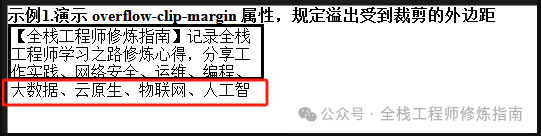
示例1.演示 overflow-clip-margin 属性,规定内容溢出受到裁剪的外边距。
<style>
.box {
  border: 3px solid black;
  width: 250px;
  height: 50px;
  overflow: clip;
  overflow-clip-margin: 20px;
}
</style>
<div class="box">

</div>
执行结果:
9.scrollbar-color 属性 – 规定滚动条演示
描述: 此属性用于设置滚动条轨道和拇指的颜色。
语法参数:
/* Keyword values */
scrollbar-color: auto;  /* 默认平台渲染。*/
scrollbar-color: dark;  /* 显示黑色(深色)滚动条(受不同浏览器影响) */
scrollbar-color: light; /* 显示轻量(浅色)滚动条(受不同浏览器影响)*/

/* <color> values */
/* 将第一种颜色应用于滚动条拇指,第二种颜色应用于滚动条轨道。 */
scrollbar-color: rebeccapurple green;
温馨提示:经过作者测试发现 dark 与 light 并没有实现,但是我们可以通过自行设备滚轮和滚动轨道的背景色来实现,例如:
.light {
  scrollbar-width: thin;
  scrollbar-color: #ccc #eee;  /* 滚轮灰,轨道浅灰 */
}
10.scrollbar-width 属性 – 规定滚动条宽度
描述: 此属性允许开发者在元素显示滚动条时设置滚动条的最大宽度。
语法参数:
/* 关键字值 */
scrollbar-width: auto; /* 系统默认的滚动条宽度。 */
scrollbar-width: thin; /* 系统提供的瘦滚动条宽度,或者比默认滚动条宽度更窄的宽度。*/
scrollbar-width: none; /* 不显示滚动条,但是该元素依然可以滚动。*/
11.scrollbar-gutter 属性 – 为滚动条保留空间
描述: 此属性允许作者为滚动条保留空间,防止随着内容的增长而发生不必要的布局更改,同时在不需要滚动时避免不必要的视觉效果。元素的滚动条槽是内部边界边缘和外部填充边缘之间的空间,浏览器可以在其中显示滚动条。如果不存在滚动条,则檐沟将被绘制为填充的延伸部分。
查看浏览器是使用经典滚动条还是覆盖滚动条?
-
经典的滚动条总是放在槽中,当存在时会占用空间。 -
覆盖滚动条放置在内容上,而不是在槽中,并且通常是部分透明的。
语法参数:
/* Initial value */
scrollbar-gutter: auto;

/* "stable" keyword, with optional modifier */
scrollbar-gutter: stable;
scrollbar-gutter: stable both-edges;

/* 参数 */
auto : 当溢出是滚动时,或者当溢出是自动的并且框溢出时,经典滚动条会创建一个槽, 覆盖滚动条不占用空间。
stable : 当使用经典滚动条时,如果溢出是自动、滚动或隐藏的,即使框没有溢出,也会出现槽, 使用覆盖滚动条时,檐沟将不存在。
both-edges :如果边沟出现在长方体的一条内联起始/结束边缘上,另一条边沟也会出现在相对的边缘上。
示例演示:
示例1.滚动条的基础样式设置。
<style>
.scroller {
  width: 300px;
  height: 100px;
  overflow-y: scroll;
  scrollbar-width: thin;
  scrollbar-color: cornflowerblue gray;  /* 蓝色滚动,灰色轨道 */
  scrollbar-gutter: stable both-edges;   /* 两边保持空余,为滚动条留空 */
}
</style>
<div class="scroller">
  【全栈工程师修炼指南】公众号,记录全栈工程师学习之路修炼心得,分享工作实践、网络安全、运维、编程、大数据、云原生、物联网、人工智能以及书籍笔记、人生职场感悟等相关高质量文章。 花开堪折直须折,莫待无花空折枝。
  Blog:【https://weiyigeek.top】
<br/>
  【全栈工程师修炼指南】公众号,记录全栈工程师学习之路修炼心得,分享工作实践、网络安全、运维、编程、大数据、云原生、物联网、人工智能以及书籍笔记、人生职场感悟等相关高质量文章。 花开堪折直须折,莫待无花空折枝。
  Blog:【https://weiyigeek.top】
</div>
执行结果:
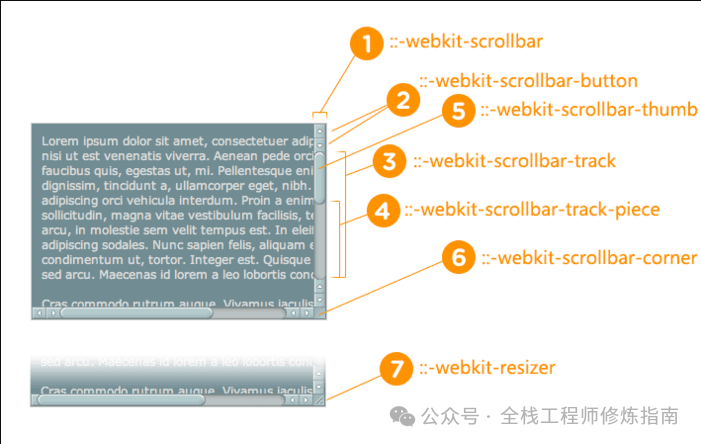
扩展示例:开发者可以使用更多的滚动条专有属性,例如,在采用以webkit为内核的浏览器中设备滚动条样式的相关属性:
::-webkit-scrollbar          //滚动条整体部分
::-webkit-scrollbar-button   //滚动条两端的按钮
::-webkit-scrollbar-track    // 外层轨道
::-webkit-scrollbar-track-piece //内层轨道,滚动条中间部分(除去)
::-webkit-scrollbar-thumb       //滚动条里面可以拖动的那个
::-webkit-scrollbar-corner      //边角
::-webkit-resizer               // 定义右下角拖动块的样式
示例演示: 以webkit为内核的浏览器其自定义滚动条样式设置。
<style>
/* 定义滚动条整体的样式 */
body::-webkit-scrollbar{
width: 10px;
background-color: rgb(20, 19, 19);
}
/* 定义滚动条轨道滚动条里面轨道*/
body::-webkit-scrollbar-track{
-webkit-box-shadow: inset 0 0 6px rgba(255, 255, 255, 0);
background-color: rgb(20, 19, 19);
}
/* 定义滚动条的样式,设置内阴影+圆角 */
body::-webkit-scrollbar-thumb{
height:20px;
border-radius:10px;
background-image: -webkit-gradient(linear,
left bottom,
left top,
color-stop(0.2, rgb(125, 126, 128)),
color-stop(0.4, rgb(142, 190, 238)),
color-stop(0.8, rgb(41, 99, 216)));
}
div {
width: 100%;
height: 1024px;
border: 1px solid black;
}
</style>
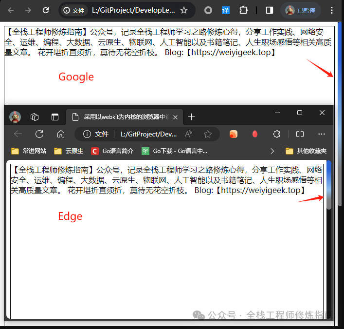
<div>
【全栈工程师修炼指南】公众号,记录全栈工程师学习之路修炼心得,分享工作实践、网络安全、运维、编程、大数据、云原生、物联网、人工智能以及书籍笔记、人生职场感悟等相关高质量文章。 花开堪折直须折,莫待无花空折枝。
Blog:【https://weiyigeek.top】
</div>执行结果:
本文至此完毕,更多技术文章,请关注我获取及时文章推送!
原文地址: https://blog.weiyigeek.top
扫码领红包 微信赞赏
微信赞赏 支付宝扫码领红包